

Jacob Kainen Painting Study Course:
“The Aura of Human Experience”
Throughout Kainen’s eight decades of work, there are common themes. Principal among these is what he called “an aura of human experience”, which he considered essential to a painting. His images, he said, most often involved a “protagonist shape with tensions around it”. In his earlier work, these ideas were expressed representationally, but later, for instance in the Totemic Figure-Symbols of the ‘70’s, the compositional tensions between the shapes evoke psychological overtones, which Kainen considered to be part of aesthetics. He also had an unfailing eye for composition, and virtuosic drawing and painting skills.
It is only in some of his later “Geometric Abstractions”, so called because of their more severe space-division (although they were not geometric in the true sense of the word), that he departed in some measure from a protagonist shape, and the distinct areas within the canvas seem to exist in more ambiguous, relationships. For this reason, they perhaps could more accurately be called “Philosophical Abstractions”, and become objects of contemplation. These pieces embody the qualifying phrase in his quote about “an aura of human experience, particularly that of the lonely Faustian thinker, combining wisdom and magic.”
Again, throughout all of his different periods, brushwork and drawing are always energetic and deft, color and form distinct, and composition dynamic. Lastly, it should be mentioned that Kainen believed drawing to be the foundation for whatever type of painting one wishes to create: “Even if your concept is just to divide a canvas in half, it’ll look better if you can draw.”
In all of the groups below, click images to enlarge; some allow scrolling within group.
Student Work, 1920’s
His representational work starts with his student days, when it was simple and straightforward, with accurate drawing and color, rendered in strong impasto technique, yet sensitive enough to show, for instance, a slight cataract in the eyes of an elderly woman model, as in “Woman in Black,” 1929, or rouge on a cheek, and the transparency of a lace shawl, as in “Copper Girl,” also 1929. These studies, done in his junior year at Pratt Institute, at age 19, did not place emphasis on composition (“It’s the last thing you get.” he would say later), but the poses are solidly observed and well placed within the rectangle.


WPA
His work for the Federal Arts Project itself was, at the urging of his friend, Stuart Davis, just within its print division, but he nonetheless was painting steadily throughout. His work in this period could be classified in basically three types: Disaster scenes, allegories, and street, or genre scenes.
Disaster Scenes, 1930’s


Allegories, Late 30’s, Early 40’s


New York Genre Scenes, Late 1930’s
These genre images’ deliberate formal simplicity, when compared to the very small, intimate and tender gouache portrait of Kainen’s fiancée, Bertha, done the same year as Hot Dog Cart, show his ability to work in whatever style suits the subject. Again, in the dead-spit portrait of Louis A. Weber, done a few years later in 1941 he paints very accurately and is psychologically astute in portraying body language, and the tension in the facial muscles.
Hot Dog Cart, 1938 28 x 36 Iconic images, strong composition, with the “X” of the apron center, simplified, pictorial forms.
Bertha, 1938 Gouache 5x7 Rendered delicately, showing Kainen’s ability to suit his style to the subject.

Barber Shop, 1939 30 x 24 Signage lettering reduced to shapes.

Louis A Weber, 1941 24 x 20 Keen psychological study.
The 40’s, the Move to Washington, and the Color School
the historian, William Agee, said “In retrospect, we might ask if this work does not mark the beginning of the Washington Color School.” He’s known for mentoring and teaching the artists of the Color School, and, whereas he did not share their desire to stain canvass, preferring not to “sacrifice mass,” as he put it, he taught them a lot about many aspects of color. For instance, how to slightly mute a color with its opposite, so as not to have raw, or “acid” colors, but rather let their juxtaposition, and how they affect each other, create that same drama and strength. He taught how to control key, saturation, vibrancy, and value, and how to let colors show through each other in layers. Gene Davis said he had learned more about art from Jacob Kainen than “any other living artist.” When looking at Davis’s color, as well as that of Tom Downing and Ken Noland, one can see Kainen’s influence.
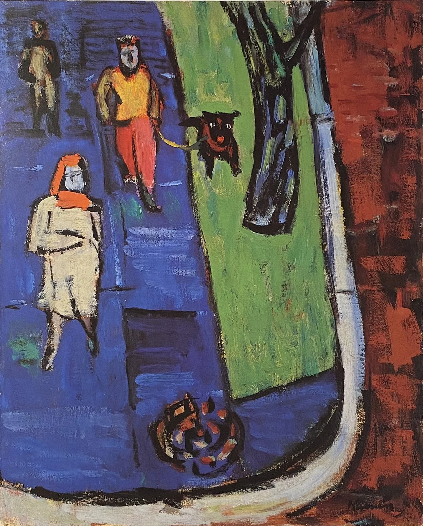
D.C. Street Scenes, 1940’s


1950’s


Abstract Expressionism, 1950’s
Rose and Gold, 1956 20 x 16
Bright Stamboul, 1957 20 x 26

Repose, Black and Blue, 1956 26 x 20

5th Avenue, 1956 20 x 16
1960’s
In the 60’s Kainen returned to the figure in a few different ways. It began with a more expressionist approach, such as in The Pair, 1960, a social dynamic is evoked, the woman in what seems a high-fashion outfit, and the man, more sober and steadfast. In “Crimson Nude”, the reclining nude in a room is thoroughly expressionist, but not angst-ridden, with bold brushwork and


“Woman In Black On a High Stool”, 1961 48 x 37

“Pregnant Woman At A Pedestal”, 1962 61” x 48”
“The Waiting Room”, 1966, 50” x 44”
“Pale Nude”, 1969 50 x 44

”The Couple II”, 1969 48 x 60

“Arctic Figure”, 1970 32 x 40
Hexagonal Protagonists

“Observer X” 1974 60 x 48

“Aladin II” 1973 48 x36

Nova I, 1977 80x60

“Nova II”, 1977 72 x54
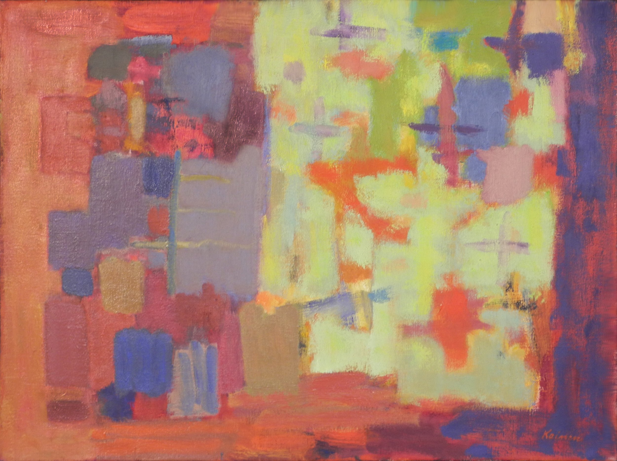
Geometric/Philosophical Abstraction, 1980’s
So-called because of their more severe space-division (although they were not geometric in the true sense of the word), these depart in some measure from a protagonist shape, and the distinct areas within the canvas seem to exist in more ambiguous, relationships. In Lumen III, the tilted diamond shape is not symmetrical; the right side’s apex is not directly across from the left’s, and the darker blue lines outside of the diamond could be expanding or constraining. When one stands in front of this large work (and this is true of all of Kainen’s later work), surprises happen. One sees that he white area of the diamond is not static, but scumbled over a very faintly darker “mystery” color. In The Way, 1979, the upper left shape is also one color scumbled over another, in this case, yellow orange over yellow green, creating an ochre, and both left hand shapes could suggest a figure, or perhaps a landscape and sky. The white area perhaps a curtain drawn aside from the orderly, yet still mysterious stack of rectangles on the right. For this reason, they perhaps could more accurately be called “Philosophical Abstractions”, and become objects of contemplation. These pieces embody the qualifying phrase in his quote about “an aura of human experience, particularly that of the lonely Faustian thinker, combining wisdom and magic.”
Lumen III, 1980 72 x 54
The Way, 1979 60 x 80
The Way XXVII, 1980 24 x 30
Loomings, 1991 60 x 80
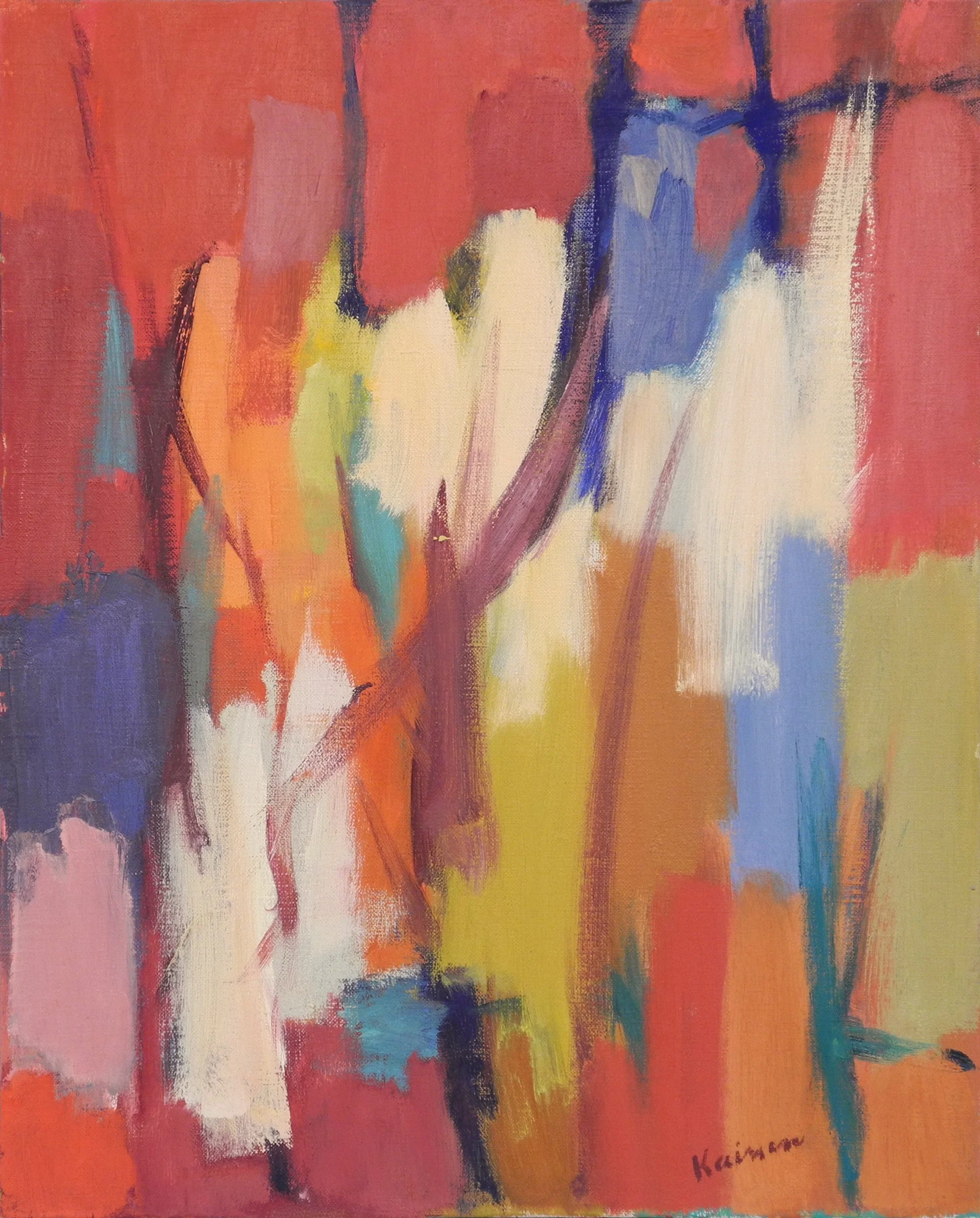
Lyrical/Traveler Abstractions
These lyrical pieces all hint at a journey of some kind. The shapes

“Envoy”, 1990 32x39

Argosy LIX, 1989 72x60

Pilot XIX, 1988 64x80
Broken Arc V, 1996-99, 80” x 64”
Periods
1. Student Work, 1920’s
2. Disaster Scenes, 1930’s
3. Allegories, 1930’s
4. New York Genre Scenes1930’s
5. D.C. Street Scenes, 1940’s
6. Semi-abstraction, 1940’s
7. Abstract Expressionism, 1950’s
8. Expressionist Figures, 1950’s - 60’s
9. Monumental Figures, 1960’s
10. Totemic Figure-Symbols, 1970’s
12. Protagonist Shapes, 1970’s
13. Lyrical Abstraction, late 1970’s
14. Geometric/Philosophical Abstraction, 1980’s
15. Traveling Abstractions: Pilot, Argosy Series
Drawings From Life, all decades